Part of an in-depth project for the UX Design Institute, I researched airline booking systems and created a recommendation for an improved user experience.
As a student, the goal of the project was to give me practical experience in the entire ux process, from researching to wireframing.
Working with this as a professional designer, my goal for a potential airline in this case, would be to reduce customer churn, improve loyalty and increase conversions.
Below you will find examples of my process and thinking in this UX project.
Usability Tests
In order to gain qualitative insights, I recruited 2 users and conducted usability sessions, testing 2 competitor apps. For the purposes of this test, it was important to have insights from users who are comfortable using mobile apps, but not experts in design or technology.
I started with a depth interview, followed up with recorded task tests. I took special care to ask non-leading, open-ended questions and made sure the users were aware that it was the software was being tested, not them. Here you can view a sample of one of the tests…
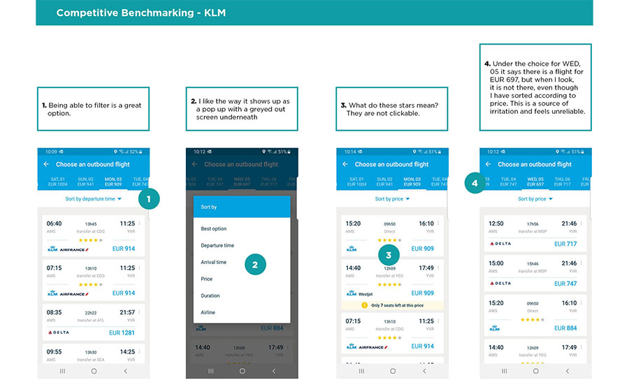
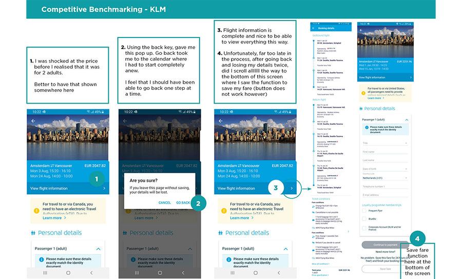
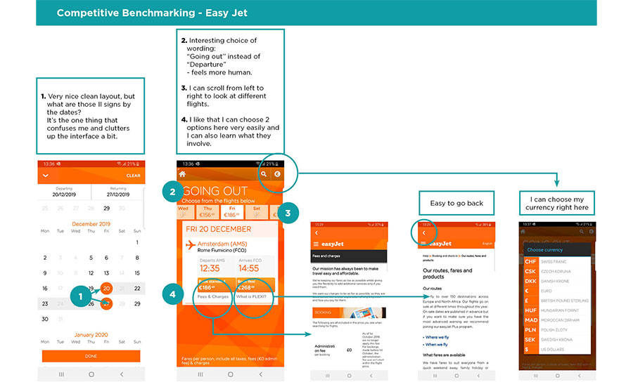
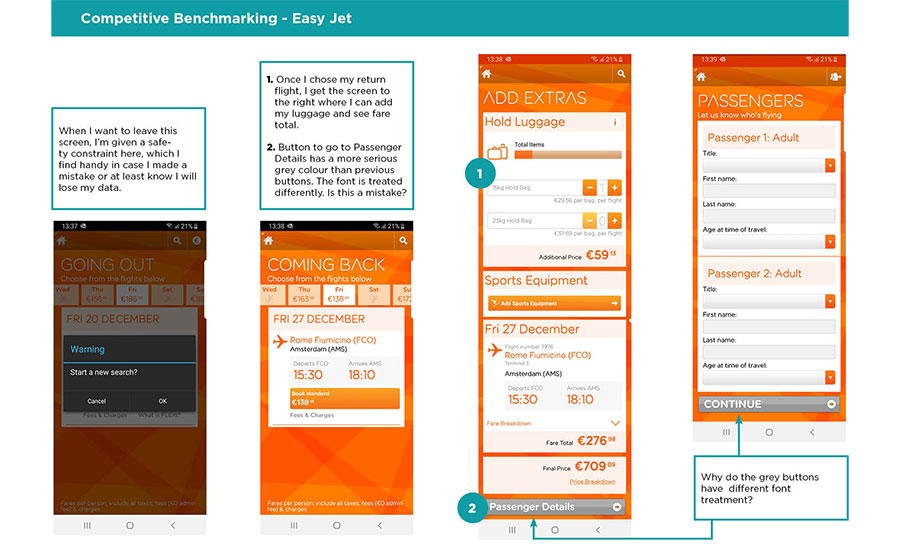
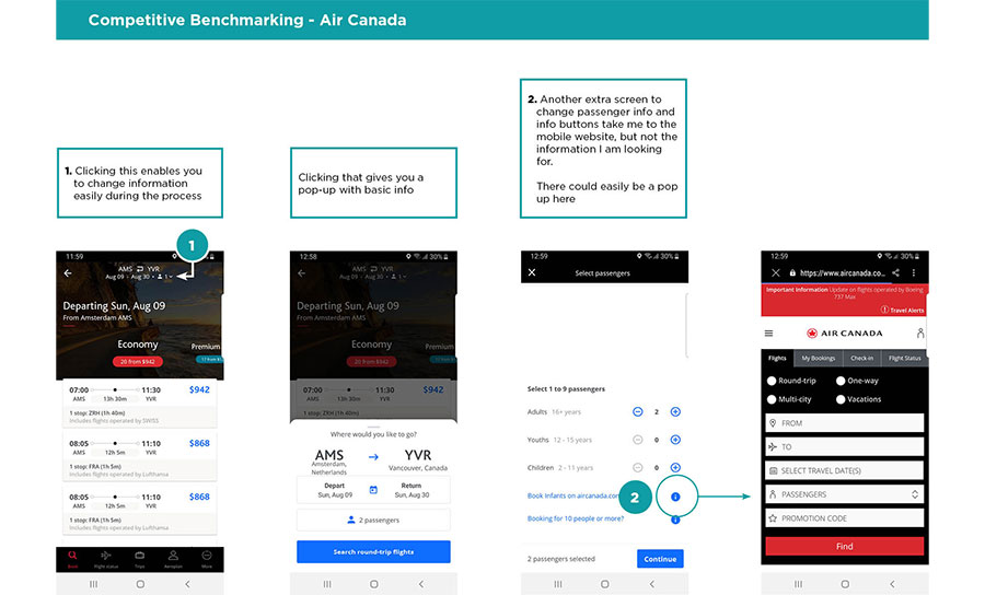
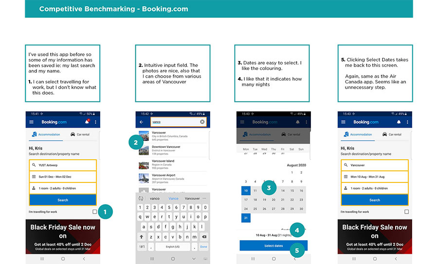
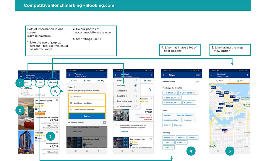
Competitor Benchmarking
I researched the mobile apps of KLM, Easy Jet, Air Canada and Booking.com to learn how they treat the ux booking process, to understand conventions and to look for best practices to emulate.

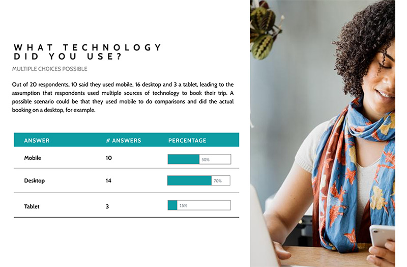
Online Questionaire
In a quantitative approach, I created a short survey with a mixture of open, closed and multiple choice questions. Out of the feedback from 20 respondents, I acquired some clear insights and possible action points.
Key Findings
Users are easily confused where they are in the process
Jargon and unclear action requests makes it difficult to make decisions
Users want transparency about pricing
Users want the process to be simple and easy to follow
Unnecessary extra screens annoys users
In general, users don’t mind giving data for a quicker result
PHASE 2: ANALYSIS
The collected data from the research provided me with some important insights, but the next task was to organise that data.
Using 3 ux strategy tools: user persona, affintity diagram & customer journey map, I formed a solid picture of the user and their needs, creating the backbone for my solutions.
User Persona: Meet Lauren

In order to simplify the design and create a clear feature heirarchy, I developed 1 main user persona which the team could consider when faced with design dilemnas. Slightly different than a marketing persona, Lauren’s profile gives insight into how she thinks as a tech user. What would Lauren want when given sorting choices? Would Lauren want to share or save her choices?
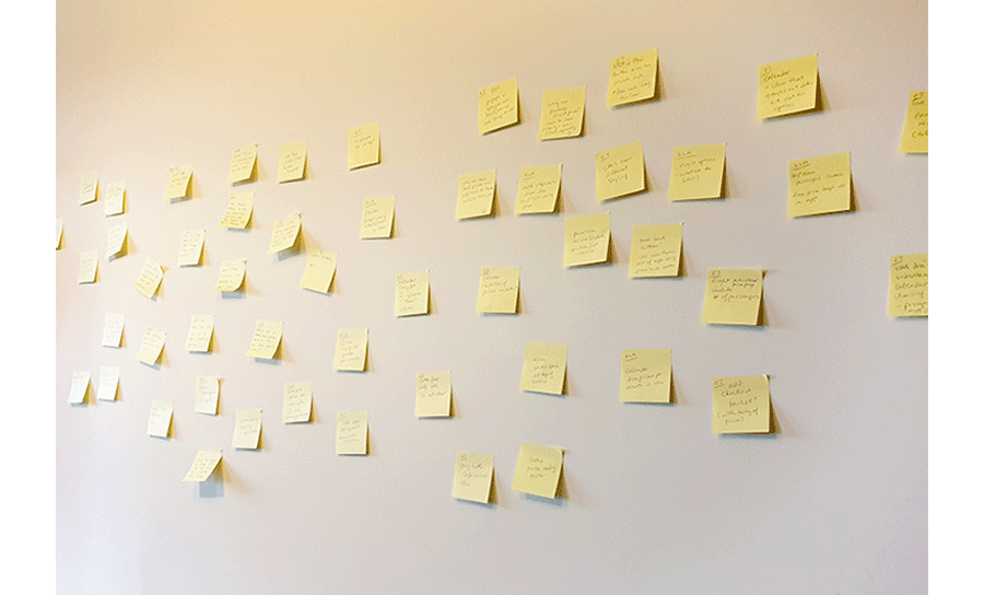
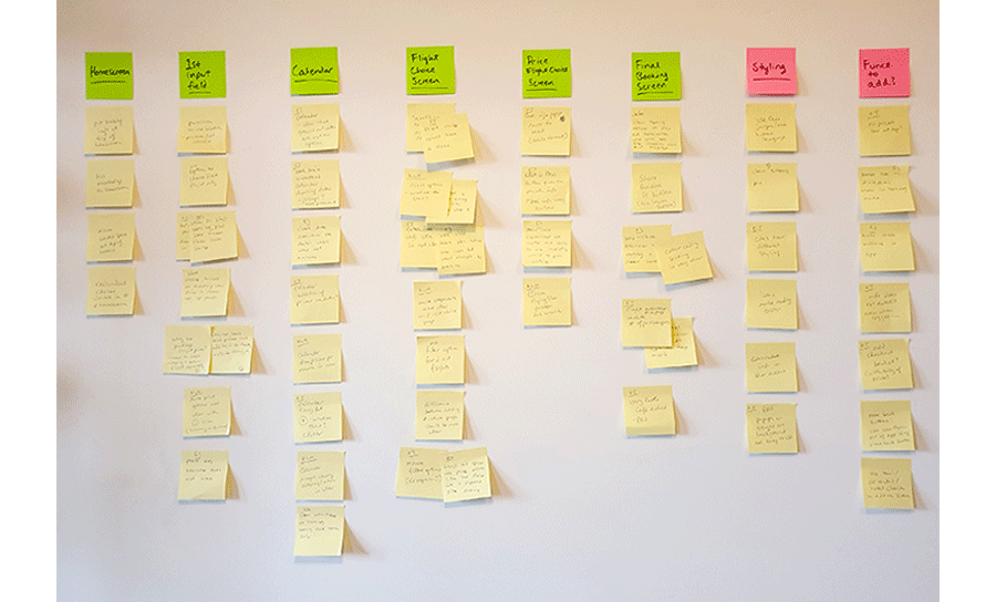
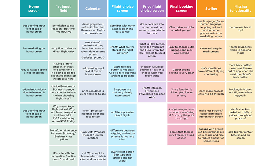
Affinity Diagram
Using the data from all the research, a colleague and I used sticky notes to document each finding. These were collected on a wall and we then sorted them into categories. It took a little time and we reiterated the categories several times until a clear pattern appeared.
Customer Journey Map
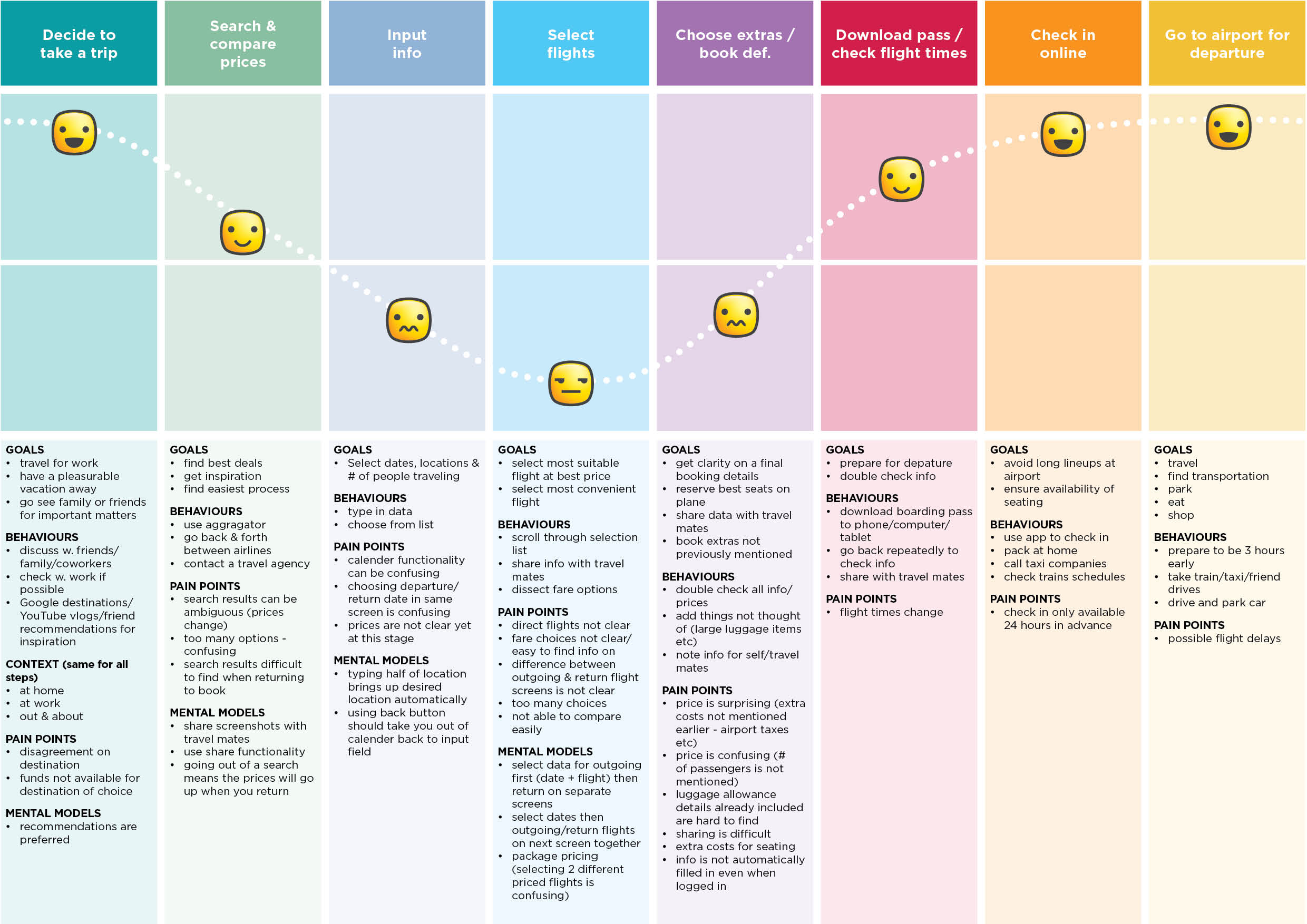
Taking note of goals, behavious, context and pain points, I mapped out the general emotional state of the user at every step of the process.
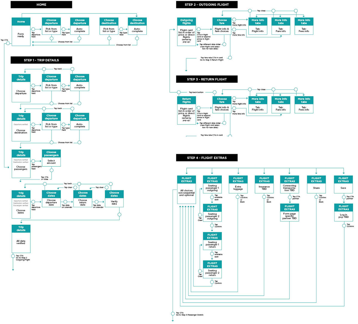
Flow Diagram
I defined a high level flow for one primary use case. Every screen and interaction was mapped out in detail and covered the user journey from the homepage to confirmation.
Implementable Actions & Features
Give booking function prominent space on homescreen
Implement a progress bar
Add a basket that updates throughout the process
Present all pricing options directly on flight card
Simplify flight card sorting options to 2 most common
Add smart defaults to expedite process
Interaction Design
With the basic flow in place, I was able to do rough sketches of the screens, where I visualised some problem solving features: progress bar, pop-up basket and clear navigation.


PHASE 4: PROTOTYPES
With the flow structure in place and the sketches forming a base for my designs, I created a medium fidelity prototype first in Sketch and InVision and then later, in a second iteration, in Principle.
The goal at this stage was to do a quick user test so the solutions could be tested and adjusted if necessary.
Iteration 1
In order to test my solutions, a mid fidelity prototype built in Sketch & Invision was sufficient to test and get good user feedback, essential before I could continue designing. A few improvement points were discovered…
FINDINGS
- Calendar
- user clicks indicator tab at top instead of directly on calendar
- amount of days is confusing and seems unnecessary
- Seating
- diagram not clear
- user is confused why he has to fill in seating twice (not clear that user has to fill in seating for both flights)
- Flight Extras
- CTA looks like the rest of the data selection buttons and text not clear
Iteration 2
Aside from making some structural changes, I tweaked the UI and added a few transitions to make the process more clear (animations between steps, expanding flight cards, etc.). The 2nd prototype was built in Principle.
IMPROVEMENTS
- General UI
- give tab structure a consistent style across app for more clarity
- create a different style for data selection buttons and CTA buttons
- improve wording of CTAs
- add animations to emphasize place in process
- Calendar
- change wording on tabs to clarify action needed
- remove amount of days – too much unnecessary data
- Seating
- add buttons to indicate which leg of the trip user is validating
CONCLUSION
Empathy for your customer, strategy for your team
While conducting the user tests and gathering research data, it became apparent that not all design solutions are obvious to users. Being able to listen actively and divine trends in research data gave many insights which otherwise might have been overlooked.
It was important to be well prepared with an efficient strategy before designing even one screen. This way an entire team could, theoretically, work seamlessly without losing track of the master plan.
As a student project, I did this almost entirely on my own, but I can truly see that the best results are produced as a team effort. From good testing, to analysing data, to designing and presenting solutions, the more heads put together the better!
VIEW MORE PROJECTS